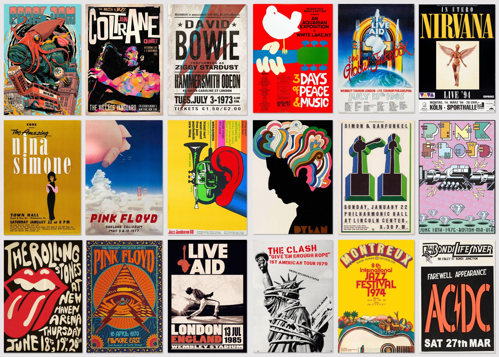
The Art We Listen To: How Visual Artists Shape Music
Sometimes we remember an album’s cover before we remember its title. A colour, a face or an unexpected image becomes inseparable from the music. Seeing it again can bring back the circumstances in which we first heard it.
Album artwork occupies an unusual position. It is a creative work, a commercial commission and an object of personal attachment. It might appear on a record sleeve, a bedroom wall or a phone screen. Across those settings, it helps give sound a visual identity.
A recent column by Gary Grimes for It’s Nice That explores pop musicians’ collaborations with fine artists, considering how those partnerships influence their cultural standing. It raises a wider question for art and design: what happens when an image becomes the way we recognise a body of music?

An image before the first note
An album cover introduces a mood before anything plays.
An isolated figure might suggest intimacy. An elaborate scene can promise spectacle. A deliberately awkward composition may create tension or uncertainty. These are invitations to interpret what follows.
A painted portrait adds another person’s reading of the musician. Decisions about posture, colour, setting and expression shape the figure we encounter. The result can sit somewhere between a recognisable person and an imagined character.
The musician is handing part of their public identity to someone else. That makes the collaboration interesting: two creative perspectives have to occupy the same frame.


A small surface with a large cultural life
The exchange between visual art and music has a long history. Andy Warhol’s banana artwork for The Velvet Underground & Nico provides a particularly enduring example. The album sleeve is represented in the Museum of Modern Art’s collection, placing a commercially distributed music object within a design and art context.
Its impact offers a useful design lesson. An image does not need to describe a musician or illustrate a song to become closely associated with the work.
An unexpected object can create a question. A simple silhouette can remain recognisable across different sizes and formats. Leaving something unexplained gives the audience room to develop its own associations.
Over time, listening supplies another layer of meaning. The picture becomes attached to particular tracks, people and experiences. What began as someone else’s design becomes part of a listener’s personal history.

When two creative identities meet
Collaboration becomes more complicated when both participants have an established visual identity.
Lady Gaga’s work with Jeff Koons on ARTPOP brought a pop performer into the sculptor’s practice. The partnership extended the album’s imagery into sculpture, making the relationship between musician, image and physical object explicit.
Such collaborations invite several readings. They can express admiration between artists, introduce each to a different audience or help establish a new direction for a release.
They can also invite scrutiny. Does the artwork contribute something specific to the music? Does the partnership allow either participant to do something unexpected? How much of its appeal depends on recognising the names involved?
These questions apply to creative commissions well beyond music. A famous collaborator can attract attention, but the relationship between the work and its purpose still matters.


The pleasure of a physical object
A record sleeve gives an image space. There is a front, a reverse, perhaps an interior spread, printed lyrics or details that reward looking closely.
That sequence changes the encounter. Picking up a record, removing it from its sleeve and reading the credits creates time around the music. Paper, finish, typography and scale all become part of the experience.
On a screen, the same artwork works under different conditions. It may be encountered briefly and at a small size, competing with other images. A clear shape or distinctive colour can help it remain recognisable, while finer details emerge elsewhere.
Designing across these formats means considering several kinds of attention. The image needs to survive a glance and still offer something when someone chooses to spend longer with it.


Who gets remembered?
Music artwork also raises a question of authorship.
Listeners may know an album intimately without knowing who painted, photographed or designed its cover. The image becomes attached so firmly to the performer that its maker can disappear from view.
Yet the finished work may involve a painter, photographer, art director, graphic designer, stylist, set builder and printer. Their decisions influence how the music is introduced and remembered.
Crediting those contributions helps audiences understand how visual culture is made. It also creates routes to discovery: someone drawn to an album cover might go on to explore the artist’s paintings, a designer’s publications or a photographer’s wider practice.

Art encountered in everyday life
For many people, record sleeves, posters and music videos are early encounters with visual art. They are chosen, collected, discussed and lived with.
That gives music imagery a particular intimacy. A gallery visit might last an afternoon; an album cover can remain in someone’s home for decades. Its meaning changes as the listener changes.
The most compelling collaborations make room for that continuing relationship. They give the music a recognisable presence while leaving enough uncertainty for the audience to keep looking.
Eventually, image and sound become difficult to separate. We hear something when we see the cover, and picture something when the music begins.
PakarPBN
A Private Blog Network (PBN) is a collection of websites that are controlled by a single individual or organization and used primarily to build backlinks to a “money site” in order to influence its ranking in search engines such as Google. The core idea behind a PBN is based on the importance of backlinks in Google’s ranking algorithm. Since Google views backlinks as signals of authority and trust, some website owners attempt to artificially create these signals through a controlled network of sites.
In a typical PBN setup, the owner acquires expired or aged domains that already have existing authority, backlinks, and history. These domains are rebuilt with new content and hosted separately, often using different IP addresses, hosting providers, themes, and ownership details to make them appear unrelated. Within the content published on these sites, links are strategically placed that point to the main website the owner wants to rank higher. By doing this, the owner attempts to pass link equity (also known as “link juice”) from the PBN sites to the target website.
The purpose of a PBN is to give the impression that the target website is naturally earning links from multiple independent sources. If done effectively, this can temporarily improve keyword rankings, increase organic visibility, and drive more traffic from search results.
Streaming Film
Nonton Film gratis
Jasa Backlink
Download Anime Batch